
Interested in learning practical email design tips? Let’s put Performance Web Design theory into practice. I’ll show you real-life examples and deconstruct our client’s mailing creation. I’ll also tell you what are the most common design mistakes and how to effectively eliminate them, following PWD rules.
Win the battle for customers’ attention with email design
In our client’s email, which was used in campaigns, we can notice one of the most common mistakes made during the creation of sales emails. The designer forgot about the 8 seconds rule. It holds that the upper 350px of an image is the most crucial element because it attracts users’ attention.
Remember:
Don’t let your customer omit the first part of your email. You have only 8 seconds to grab his attention – that’s the amount of time he needs to scan your design and decide whether to scroll down or delete your message.
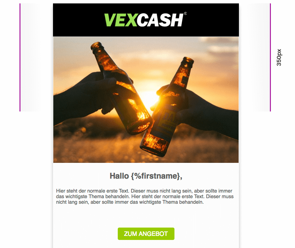
On the image above, you can see the content of the upper 350px. It lacks elements that would encourage users to read the text.
Notice the size of the logotype at the top of the email design. Do not follow “the bigger the better” rule. The brand’s visual identity shouldn’t cover a large part of the composition because the larger the logotype is the lower you actually put the main message – the most important part of your email. That’s the mistake our client made. Almost ⅓ of the upper 350px is taken by the logotype instead of the main message.
In summary:
Place the most important information in the upper 350px of your email design because that’s where customers look when they open your email.
Find more information about this rule in my other article titled “How to design effective emails – practical tips”.
One picture is worth a thousand words!
Always use a photograph in your main message. It will help you direct the user’s eyes to specific elements. Our client used an image that doesn’t tell much to the recipient.
Follow these rules to reinforce your email campaign message:
- Replace stock photos with real ones. We got used to bank images as they literally flood the Internet. They are so common that we automatically see them as advertisements and become indifferent to them. Sometimes, stock photos look so unprofessional that they become an object of ridicule. That’s the worst thing that could happen to you. Remember that in the long run, authentic photos always pay off better.
- Choose high-quality photos. Don’t exaggerate with photo editing. Adjusting contrast and colour balance will be enough. Avoid disproportionate scaling and don’t enlarge images unless it’s necessary. Otherwise, you increase the risk that your photo loses in quality.
- Use photos only from legitimate sources. If you really need to download a stock image, make sure that you have the right to use it.
- Avoid heavy photos and make image compression a habit. There are lots of free online compressors, such as tinypng.com, that will allow you to reduce the weight of your files without losing in their quality.
- Try to choose images with women and children. Eye-tracking studies show that users positively receive photographs with female and child faces.
CTA – the king of buttons
Although placing a Call-to-Action on a banner is perfectly obvious, many designers don’t know how to make users click on it. CTA invites interaction. It’s the most important element of your design and the last step of the user’s email journey. Its goal is to make the user click, that is, take your bait. The email we discuss lacks several key elements that would make the CTA stand out.
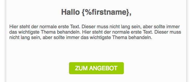
1. There is too much space between the text and CTA button
Don’t allow users to lose the bait. Lead them from the foothold (text) to the button. To achieve higher conversion, you should connect it to your main message. Don’t place it below the text lower than half of the button’s height.
2. The CTA doesn’t stand out because of its small size
The CTA button should have a colour that contrasts with the background. Remember, however, that you have to choose it wisely. If you want to know more about the psychology of colours, read Ola’s article. Don’t forget about the design for fat fingers rule. It holds that clickable elements for mobile screens shouldn’t be smaller than 44px in height. This is the most important rule if it comes to designing the proper size of a CTA.
3. Use your text to tell the user what he’ll gain after he clicks on the CTA
Don’t raise your customer’s concerns, but rather lead him throughout the whole sales process by the hand.
Social Proof authenticates the brand and its message
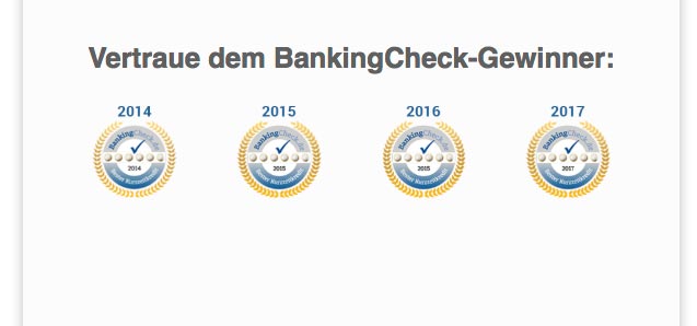
Social proof is a useful tool both for you and your client. It can, in an easy and effective way, authenticate your brand and the products you offer. Prove to your client that he can trust you and that you can meet his expectations. What’s the simplest way to do this? Present your company’s achievements in an infographic, just like in the example below. You can show the prizes you have won or positive opinions of satisfied clients.
Fine feathers make fine birds
In the times of increasing visual sensitivity, there is no place for design mistakes. Our client’s email contains a fundamental error, which negatively affects user experience. Too large white spaces between consecutive sections make it uncomfortable to read the text.
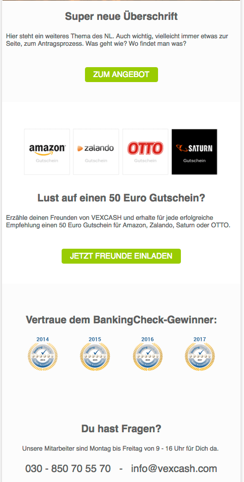
It’s easy to lose the thread in between them. They do allow to separate content but you can’t exaggerate with their size. Adjust them in such a way as to maintain narrative and visual continuity. Unfortunately, there are no rules that establish the specific size of white spaces. You have to follow your own intuition.
Also, remember that your text cannot contain too many sections. Don’t bombard the reader with too much information because he’ll still remember only those things that are important to him. Less is more – reduce the amount of CTA buttons, text, and images and you’ll notice an increase in conversion.
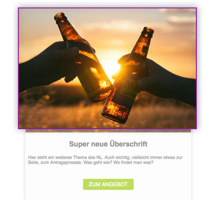
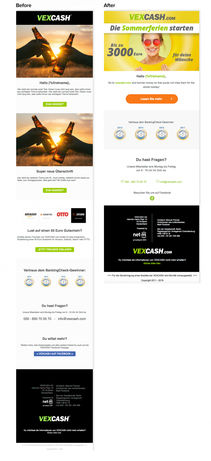
Email design comparison
I faced the challenge of improving our client’s email design according to Performance Web Design rules. You can compare individual elements and share your observations in the comments.
If necessary, read my article where I describe how to design effective emails in detail.
Design effective emails
In my opinion, it’s worth sharing best practices and experience from successful projects. Let me end this article with some statistics to reveal how changes in our client’s design, made according to the Performance Web Design method, improved conversion.
2 email designs created by DOT Partners increased conversion by almost 130%! The projects prepared for VEXCASH.com got a higher CTR than the previous 24 sales emails of our client. Improvement in conversion led to a 200% increase in sales.
Be methodical and practice
I hope that thanks to this article, you’re able to look at email design and the PWD method from a different perspective. If you follow PWD rules, you’ll control how users read your emails and improve conversion. If you have any questions or doubts, feel free to contact me. I’d be happy to answer any question.